Last Updated: January 22, 2025
You can make maps that are more colorblind friendly by using size, color or pattern themes. These style or symbology adjustments make use of relative changes in shading or sizing to create differences that don’t rely just on color.
Creating colorblind-friendly maps can help ensure that anyone can easily interpret the story that your map is telling. Traditional color schemes can make it difficult for colorblind folks to interpret map data accurately. By using colorblind-friendly palettes and design principles, you can enhance readability, improve user experience, and ensure that critical information is accessible to everyone, regardless of their color vision capabilities.
To follow along with the steps in the article below, you can use your own license of Maptitude or request a free trial of Maptitude mapping software.
Table of Contents
Use a Color Theme
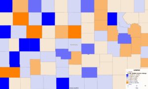
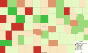
Color themes (i.e., Heatmaps) are one of the best ways to communicate large geographical trends quickly, but they can be very hard to read by colorblind folks depending on the colors. There is not a colorblind “setting”, but there are a couple best practices when choosing your color palettes.
- Blue and Orange are good options for a color theme
There are exceptions, but themes with red and green can be difficult to distinguish, making some of the ranges misleading (as can be seen in the legend of the sample map).
- Avoid red and green
Again, there can be exceptions, but blue is generally a much better option for visibility especially when contrasted with orange. Both ranges are consistent and distinguishable.
For some additional suggestions on choosing your map colors, see: https://www.caliper.com/learning/what-are-the-best-map-colors-and-layers/
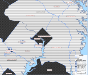
Use a Pattern Theme
Pattern themes allow users to shade areas with various dot, line, or hatch patterns to relay information without relying on color variation.
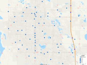
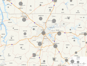
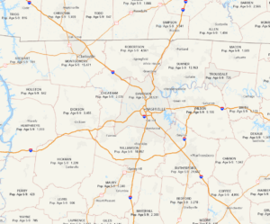
Use a Size Theme
A size theme applies different symbol sizes for numeric values to indicate volume or intensity, for example.
Use labels
The labels can be modified to include more information, such as population counts, or your own data.
Use a Multiple Symbol Theme (for point features)
For things like store or customer locations, a multiple symbol them is a good choice. This theme allows information to be conveyed using various symbol shapes, letters, or numbers.