Types of Themes
Maptitude Online can assemble information about map features to create a map that illustrates the patterns in the data using themes. Thematic maps use distinctive colors, symbols, and fill styles to portray data such as population, sales volume, home values, or income. The different styles highlight the similarities and differences among map features. When data are portrayed in a thematic map, the information becomes easier to see, understand, and interpret.
Maptitude Online supports the following theme types:
The type of themes that are available will depend upon the type of layer with which you are working. Themes that do not apply will be inactive.
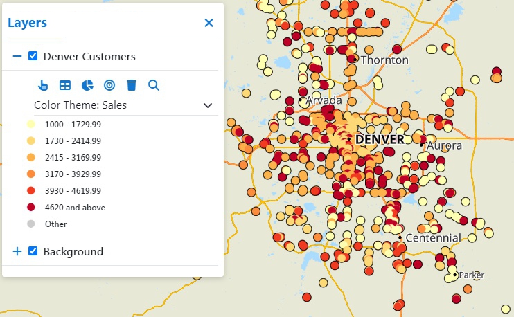
Color themes group the features in a map layer into classes, based on the value of a data field and displays each class with a unique color. Each class contains all of the features with similar values for the chosen field. This type of theme is useful for showing numeric (e.g., sales, population) and non-numeric (e.g., territory, political party) data.
This color theme shows customers with a lighter color if they have lower sales and a darker color if they have higher sales
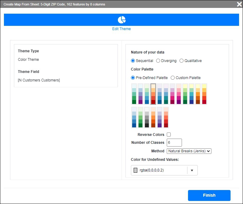
In the theme drop-down you can click  next to a color theme to modify it:
Options include:
Size themes use symbols of different sizes to show the value of a data field. Smaller features indicate lower values of the chosen field and larger features indicate higher values of the chosen field. This type of theme is useful for showing numeric (e.g., sales, population) data.
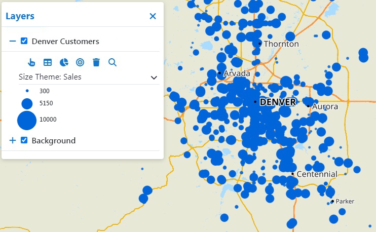
This size theme shows smaller symbols for customer that have lower sales and larger symbols if they have higher sales
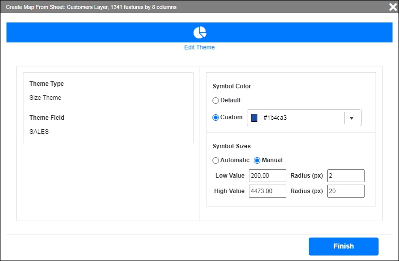
In the theme drop-down you can click
next to a size theme to modify it:
Options include:
Symbol themes group the features in a map layer into classes, based on the value of a data field and displays each class with a unique symbol. Each class contains all of the features with similar values for the chosen field. This type of theme is useful for showing non-numeric (e.g., territory, political party) data.
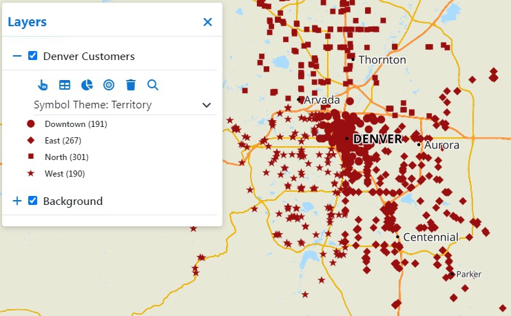
This symbol theme shows customers where different symbols correspond to the territory to which they belong
In the theme drop-down you can click
next to a color theme to modify it:
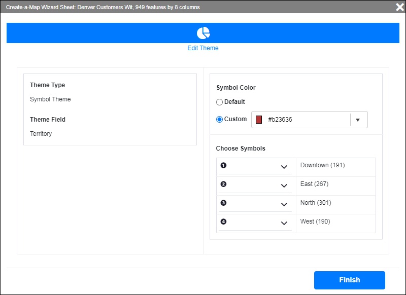
Options include:
Chart themes place pie or vertical bar charts on map features to illustrate data that go with the respective features. This type of theme is useful for showing numeric data in more than one field (e.g., income classes, sales by quarter, mode of commute).
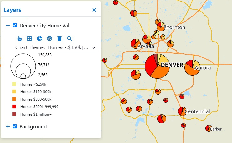
This pie chart theme shows the number of homes in various cities and the values of those homes. The overall size indicates how many homes are in a city and the individual slices indicate the proportion of home values within that city..
In the theme drop-down you can click
next to a color theme to modify it:
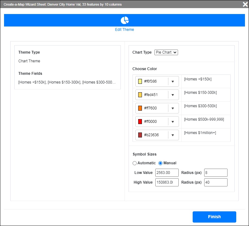
Options include:
Cluster themes group densely located point features into clusters and labels the cluster with the number of features in that cluster. This type of theme is useful for visualizing the density of features in different locations.
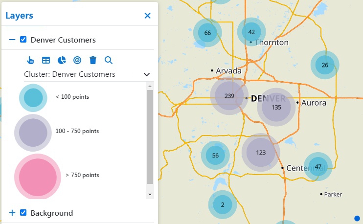
This cluster theme shows clusters of customer locations.
Cluster themes have no user-defined options.
Density themes use different colors that correspond tot he density of point features. This type of theme is useful for visualizing the density of features in different locations.
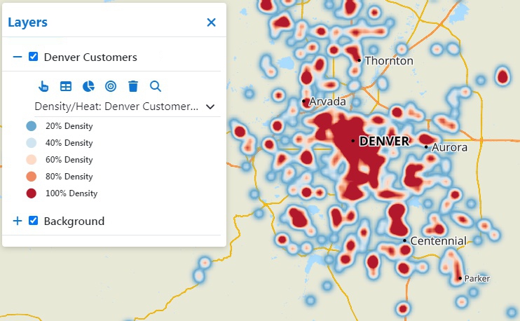
This heat theme shows where customers are more densely located.
Density/heat themes have no user-defined options.
©Copyright Caliper Corporation www.caliper.com