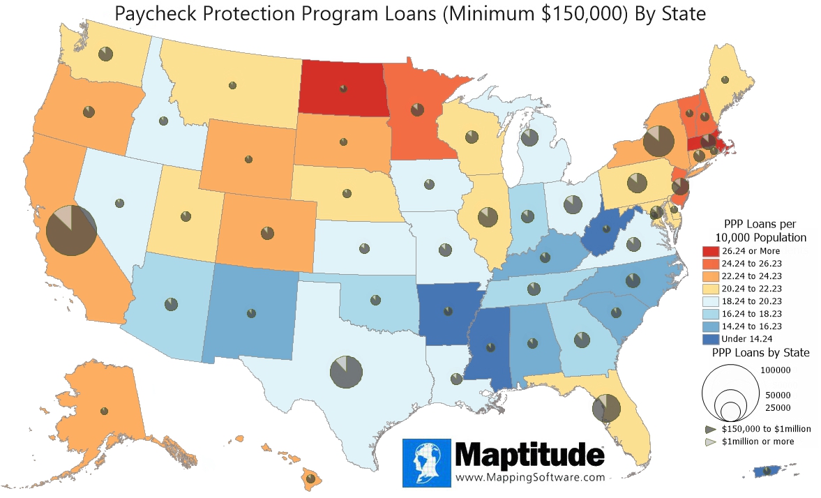
Maptitude is the best mapping software for business intelligence! This map examines the distribution of the largest Paycheck Protection Program (PPP) loans that were offered as stimulus to small businesses as part of the CARES act. There were 577,961 loans of $150,000 to $1 million and another 82,663 loans of over $1 million. The pie charts show the number of loans to businesses in each state and the proportion of loans that were over $1 million. Unsurprisingly, the states with the largest populations accounted for the greatest number of loans (California - 87,689; Texas - 52,149; New York - 46,887; and Florida - 42,199). Loans of over $1 million accounted for a low of 8.8% of all PPP loans in Wyoming to highs of 14.9% in Kansas and 15.2% in Washington DC.
On average, there were 20.24 of these loans made for every 10,000 people in the United States. The color theme shows how the number of loans per capita deviates from the average. States and territories shown in shades of orange and red had more than 20.24 loans per 10,000 residents and those shown in shades of blue had fewer. Washington DC and North Dakota had the highest number of loans per resident and Puerto Rico and West Virginia had the lowest.
If you need a custom map for your story, blog, or website, contact us because we offer a limited number of free custom maps on a first-come, first-served basis! See our Featured Maps for inspiration.
Map: Created with Maptitude Mapping Software by Caliper, July 2020
Home | Products | Contact | Secure Store
