Maptitude is the best mapping software for business intelligence! Maptitude mapping software supports mapping data in numerous formats allowing you to incorporate data from numerous sources, including public data sources such as the National Highway Traffic Safety Administration (NHTSA), in your maps.
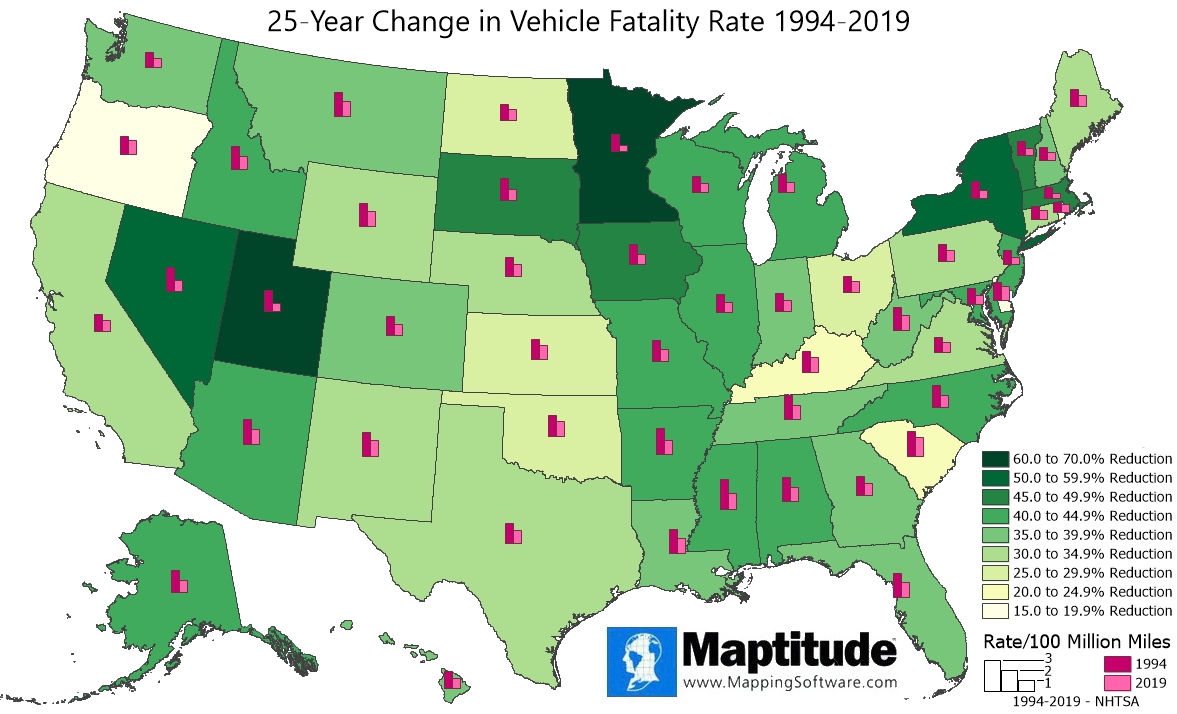
Over the 25-year span from 1994 to 2019 traffic fatalities have decreased in the United States. In that span, the fatality rate per 100 million vehicle miles travelled has decreased 36%, from 1.73 to 1.11. This Maptitude map shows how the 25-year fatality rates have changed by state. You can see that every state has seen a drop in the fatality rate over the 25 years. Four states had fatality rates that were at least 50% lower in 2019 compared to 1994: Utah (61%), Minnesota (60%), Nevada (53%), and New York (50%). A companion map shows the most recent fatality rates by state.
If you need a custom map for your story, blog, or website, contact us because we offer a limited number of free custom maps on a first-come, first-served basis! See our Featured Maps for inspiration.
Map: Created with Maptitude Mapping Software by
Caliper, Janauary 2022
Source: NHTSA 2019
#Maptitude #Traffic #Highway #Safety
Home | Products | Contact | Secure Store
